You’re building something new, and every decision feels like it could make or break your startup. The problem is, you’re often making those decisions based on gut feelings rather than real data. You wonder if people are actually using that new feature you spent weeks building, or why visitors keep dropping off at the same point in your signup flow.
That’s where analytics tools come in. They turn those hunches into hard numbers, showing you exactly what’s working and what needs fixing. But with so many options out there, choosing the right one can feel overwhelming.
This guide breaks down 9 analytics tools specifically for startups, organised by what they do best. Whether you need to understand website traffic, track user behaviour in your app, or visualise how people interact with your product, you’ll find the right tool here.
Rundown
- Essential Website Traffic Tracking: Google Analytics, “The industry-standard free platform used by over 37 million websites globally, offering comprehensive traffic analysis, user behaviour tracking, and seamless Google Ads integration.”
- Privacy-First Web Analytics: Plausible Analytics, “A cookie-free, GDPR-compliant alternative to Google Analytics with a script 75 times lighter than GA, trusted by over 16,000 paying customers who want clean insights without privacy baggage.”
- All-In-One Product Analytics: PostHog, “An open-source developer platform combining product analytics, session replay, feature flags, A/B testing, and error tracking in one unified stack, with 98% of customers on the free tier.”
- User Behaviour & Retention Analysis: Amplitude, “A leading digital analytics platform rated #1 for product analytics on G2, trusted by roughly 3,000 customers including 26% of the Fortune 100 for deep behavioural and retention insights.”
- Event-Driven Product Analytics: Mixpanel, “A precision event-tracking platform favoured by over 7,000 paying customers, including Uber and DocuSign, for tracking exactly what users do at each step of their product journey.”
- Automatic Event Capture: Heap, “An analytics platform that automatically captures every user interaction from day one with no manual setup, letting you ask retroactive questions about behaviour you didn’t know to track.”
- Visual Behaviour Insights: Hotjar, “A behaviour analytics platform trusted by over 1.1 million websites in 180+ countries, combining heatmaps, session recordings, and user feedback to show the why behind the numbers.”
- Mobile App Attribution: AppsFlyer, “The global leader in mobile measurement and attribution, holding an estimated 75% market share and helping 10,000+ technology partners connect their ad spend to real app installs and revenue.”
- Clean Privacy-Compliant Web Analytics: Simple Analytics, “A no-cookie, no-personal-data analytics platform built for teams that need clear, instant insights without GDPR complexity or the learning curve of enterprise-grade tools.”
ESSENTIAL WEBSITE TRAFFIC TRACKING
Google Analytics
Feature | Details |
|---|---|
Best For | Essential website traffic tracking |
Pricing | Free, with Google Analytics 360 from ~$50,000/year |
Key Features | User behaviour analysis, marketing campaign tracking, Google Ads integration |
Free Plan | Yes – fully featured for most startups |
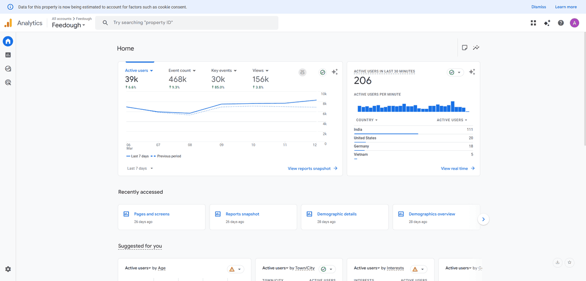
When you need to understand who’s visiting your website and what they’re doing there, Google Analytics is where most startups begin. It’s the free platform that powers over 37 million websites globally, making it the undisputed industry standard for web analytics.
What makes Google Analytics different is the sheer depth of data available at no cost. You’re not getting a stripped-back free tier, you’re getting the same platform that enterprise companies use, including full audience reporting, acquisition channels, behaviour flows, and conversion tracking. Google Analytics is used by 55% of all websites globally, which tells you something about how much the industry trusts it as a baseline for decision-making.
Think about what you actually need to know as a startup. Where is your traffic coming from? Which pages are converting visitors into signups? What devices are people using? Are your paid campaigns delivering real value? Google Analytics answers all of these out of the box, once you add a single tracking snippet to your site.
The Google Ads integration is particularly valuable if you’re running any paid acquisition. You can see exactly which campaigns drive signups rather than just clicks, which means you can cut wasteful spend early and double down on what actually works.
But here’s what you should know: GA4, the current version, has a steeper learning curve than its predecessor. The interface takes time to navigate, and extracting specific insights often requires building custom reports. You’ll also need to implement cookie consent banners in most markets, which adds friction to your visitor experience.
This tool works best for startups that need comprehensive web analytics at zero cost and are comfortable investing time in learning the platform. It’s less ideal if you need instant, simple dashboards or if privacy compliance is a primary concern for your audience.
PRIVACY-FIRST WEB ANALYTICS
Plausible Analytics
Feature | Details |
|---|---|
Best For | Privacy-focused website analytics |
Pricing | From $9/month (30-day free trial available) |
Key Features | Cookie-free tracking, GDPR compliant, 75x lighter script than GA |
Free Plan | No – paid only after trial |
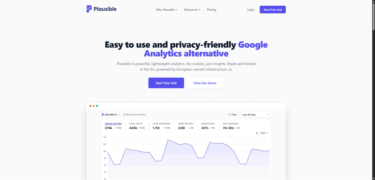
If Google Analytics feels too heavy or you’re worried about privacy regulations, Plausible Analytics offers a genuinely cleaner alternative. This tool gives you the essential website metrics you need without tracking personal data, setting cookies, or requiring consent banners on your site.
What makes Plausible different is its philosophy about what analytics should actually be. You’re not getting buried in hundreds of reports covering metrics you’ll never use. Instead, everything fits on a single dashboard page, and it loads in under a second. Over 16,000 paying customers have made the switch from Google Analytics, including teams at Hugging Face and Basecamp, because simpler and more privacy-respecting turned out to be genuinely better for their workflows.
Think about the real cost of traditional analytics. Cookie banners reduce conversion rates. GDPR compliance adds legal overhead. Data that Google collects about your visitors is used to serve them ads elsewhere. Plausible sidesteps all of that. Its tracking script is 75 times smaller than Google Analytics, meaning your pages load faster, which directly improves user experience and SEO.
You get the metrics that actually matter for day-to-day decisions: page views, unique visitors, bounce rates, traffic sources, top pages, device breakdowns, and goal conversions. You can even import your existing Google Analytics history so you don’t lose your baseline data when you switch.
But here’s what you should know: Plausible deliberately doesn’t offer the advanced segmentation, funnel analysis, or advertising integrations that Google Analytics provides. That’s an intentional product decision, not a gap. If you need to go deep on user journeys or connect attribution data to ad spend, you’ll hit limits quickly.
This tool works best for content sites, SaaS products, and any startup operating in privacy-sensitive markets where GDPR compliance and user trust matter. It’s less ideal for teams that need complex multi-channel attribution or in-depth product behaviour analysis.
ALL-IN-ONE PRODUCT ANALYTICS
PostHog
Feature | Details |
|---|---|
Best For | Comprehensive product analytics in one open-source platform |
Pricing | Free tier (1M events/month), then usage-based |
Key Features | Product analytics, session replay, feature flags, A/B testing, error tracking |
Free Plan | Yes – 98% of customers use PostHog for free |
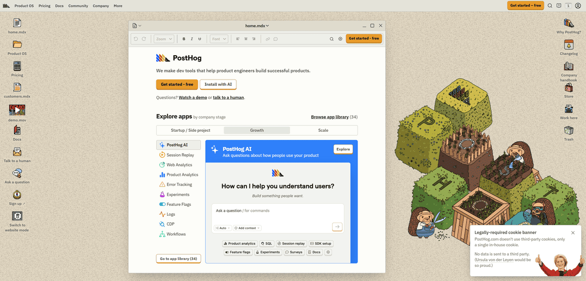
When you need more than just website traffic numbers and want to understand how people actually use your product, PostHog brings everything together in one place. Unlike basic web analytics that show you page views, this open-source platform tracks what users do inside your app, why they drop off, which features they love, and how your experiments perform.
What makes PostHog different from most analytics tools is that it replaces an entire stack rather than adding to it. Where growing startups typically juggle Mixpanel for analytics, Hotjar for recordings, LaunchDarkly for feature flags, and a separate A/B testing tool, PostHog consolidates all of that into one platform with a single data model. PostHog has been installed by over 108,000 companies, growing at 15.7% month-over-month for 12 consecutive months, largely through word-of-mouth within engineering teams.
Think about how product decisions actually get made. You notice a drop in activation rates. You want to watch session recordings of users who churned in the first week. You want to run an A/B test on your onboarding flow. You want to roll out a fix to 10% of users first. With PostHog, every one of those steps happens inside the same tool, with the same data, without any integration work between platforms.
The open-source model also means you can self-host for complete data sovereignty, which matters for startups in regulated industries or those building for privacy-conscious enterprise customers. The free tier is genuinely usable, covering 1 million events, 5,000 session recordings, and 1 million feature flag requests every month.
But here’s what you should know: PostHog is built for engineering-led teams, and it shows. The setup requires more technical involvement than plug-and-play tools like Hotjar, and the breadth of features means a real learning curve for non-technical team members. If your analytics needs are simple, the depth might feel like overkill.
This tool works best for product-led startups with a technical founding team who want to move fast without managing multiple analytics subscriptions. It’s less ideal for teams that only need surface-level web stats, or for those without engineering capacity to instrument events properly.
USER BEHAVIOUR & RETENTION ANALYSIS
Amplitude
Feature | Details |
|---|---|
Best For | User behaviour analysis and retention tracking |
Pricing | Free Starter plan (10K MTUs), paid plans for scale |
Key Features | Behavioural cohort analysis, funnel optimisation, retention tracking, pathfinder |
Free Plan | Yes – free Starter plan available |
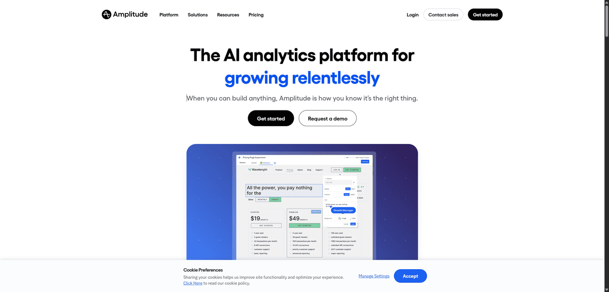
When you need to understand why users behave the way they do in your product, Amplitude focuses specifically on behavioural analysis and retention patterns. While PostHog gives you a complete developer platform, Amplitude digs deeper into the psychology of user engagement, helping you answer the questions that actually determine whether your product grows or stagnates.
What makes Amplitude different is the depth of its behavioural segmentation. You’re not just tracking events, you’re grouping users into cohorts based on what they did, understanding which actions predict long-term retention, and identifying the precise moments where you’re losing people. Amplitude is trusted by roughly 3,000 customers including 26% of the Fortune 100, and was named #1 for product analytics on G2 for consecutive years.
Think about the kind of questions that actually drive product roadmap decisions. Which features do your best-retained users engage with in their first week? What separates users who convert to paid from those who churn after the free trial? Where exactly in your onboarding flow do new users lose momentum? Amplitude is built to answer all of these, with a visual, non-technical interface that product managers and growth teams can use without writing SQL.
The pathfinder analysis is particularly powerful for early-stage products where you’re still figuring out what “good” user behaviour looks like. You can see common paths users take through your product, spot the routes that lead to retention, and start designing your experience to guide more users down those paths.
But here’s what you should know: Amplitude is primarily an analytics tool, not an engagement platform. It won’t send emails, trigger in-app messages, or manage feature releases on its own. You’ll need to integrate it with other tools for those capabilities. The depth of analysis also means the learning curve is steeper than simpler tools.
This tool works best for growth-focused startups where retention and conversion are the primary metrics to optimise. It’s less ideal if you also need feature flags, session recordings, and experiment management, since those require separate tools or a switch to a more consolidated platform.
EVENT-DRIVEN PRODUCT ANALYTICS
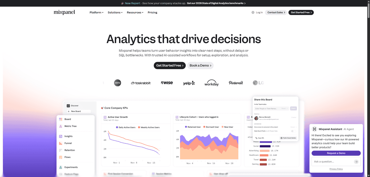
Mixpanel
Feature | Details |
|---|---|
Best For | Event-driven product analytics |
Pricing | Free plan (1M events/month), paid plans scale with usage |
Key Features | User action tracking, conversion funnels, retention analysis, cohort segmentation |
Free Plan | Yes – up to 1 million monthly events |
If you want to track specific actions users take in your product rather than just page views, Mixpanel takes a precision event-driven approach to analytics. While Amplitude focuses on behavioural patterns and PostHog bundles in tools across the product lifecycle, Mixpanel helps you understand exactly what users do at each step of their journey with a maturity and reporting depth that’s hard to match.
What makes Mixpanel different is its philosophy that actions speak louder than page views. Every event, whether a button click, a form submission, or a feature usage, becomes a data point you can query, filter, and build funnels from. Over 7,000 paying customers trust Mixpanel, including Uber, Yelp, and DocuSign, drawn to it for the precision and context-richness of its reporting.
Think about how powerful it is to answer product questions with real data. What percentage of users who try your collaboration feature become paying customers? Which signup flow variant converts better on mobile versus desktop? Which actions in the first session predict whether someone comes back next week? Mixpanel is built to answer these kinds of questions quickly, without needing a data analyst to run the queries for you.
The cohort analysis lets you group users by behaviour and compare how different segments evolve over time. You can track users across devices and sessions to understand how behaviour changes as they get more familiar with your product, which is invaluable for making onboarding and activation decisions.
But here’s what you should know: Mixpanel requires upfront planning. Because it’s event-based rather than autocapture, you need to define your event taxonomy before you instrument tracking. Getting this wrong early means messy, inconsistent data later. The setup is more technical than plug-and-play tools, and the interface can feel dense if you’re new to product analytics.
This tool works best for product-focused teams that want precise, queryable event data and are willing to invest in setting up their tracking properly. It’s less ideal if you need a tool that works out of the box without engineering effort, or if you want session replay and feature flags included alongside analytics.
AUTOMATIC EVENT CAPTURE
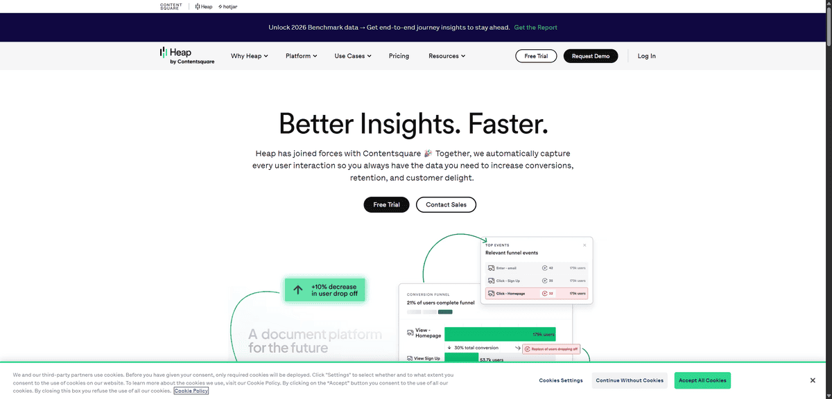
Heap
Feature | Details |
|---|---|
Best For | Automatic event capture without manual setup |
Pricing | Free tier available, paid plans based on usage |
Key Features | Automatic interaction tracking, retroactive analysis, unified user profiles |
Free Plan | Yes – free tier for early-stage startups |
If you’re tired of manually setting up event tracking or don’t have a dedicated analytics team, Heap takes a fundamentally different approach. Unlike tools like Mixpanel where you need to define every event you want to track before it starts collecting data, Heap automatically captures all user interactions the moment you install it, with no manual configuration required.
What makes Heap different is its Smart Capture technology, which records every click, swipe, form fill, tap, and page view from the first minute. You add one snippet of code to your website or app, and Heap immediately starts building a complete picture of how users interact with every element. The key unlock is retroactive analysis: if something unexpected happens in your product three months from now, you can go back and ask questions about behaviour that occurred before you even knew to track it.
Think about the practical value for a startup moving fast. Your engineering team doesn’t have to instrument every new feature before it ships. You don’t lose historical data when you realise you should have been tracking a particular button. And you don’t need to plan your entire event taxonomy before you understand what your users actually do. Heap captures everything first, and you define what matters later through its visual interface.
The unified user profiles pull together data from different sessions and devices, giving you a full picture of individual user journeys rather than disconnected events. You can define funnels and segments visually, without writing code, which means product managers and marketers can run their own analysis without waiting for engineering support.
But here’s what you should know: Heap’s autocapture generates a huge volume of raw data, which means you’ll spend time filtering out noise to find meaningful signals. The interface, while accessible, can feel less customisable than code-first alternatives for technical teams with complex, specific tracking requirements.
This tool works best for startups that want immediate analytics coverage without the upfront engineering investment, particularly teams iterating quickly on product and UX. It’s less ideal for companies that need very precise, low-level event data from day one, or for highly technical teams who prefer full control over their data model.

VISUAL BEHAVIOUR INSIGHTS
Hotjar
Feature | Details |
|---|---|
Best For | Visual insights into website user behaviour |
Pricing | Free plan available, paid plans from $39/month |
Key Features | Heatmaps, session recordings, conversion funnels, user feedback surveys |
Free Plan | Yes – limited recordings and heatmaps |
When you need to see how people actually use your website rather than just looking at numbers, Hotjar gives you visual tools that show user behaviour in action. Unlike event tracking tools that tell you what happened, Hotjar shows you how it happened, through recordings of real sessions and heatmaps that make user confusion immediately visible.
What makes Hotjar different is how it bridges the gap between data and intuition. You’re not staring at a conversion rate and trying to guess why it dropped. You’re watching a real user encounter a broken button, hesitate at a confusing form field, or scroll past a CTA they never noticed. Hotjar is trusted by over 1.1 million websites in 180+ countries, from early-stage startups to companies like Microsoft and Nintendo, because seeing behaviour directly is often more actionable than aggregated metrics.
Think about the UX problems that are invisible to traditional analytics. Your checkout conversion is lower than expected, but Google Analytics just shows you a drop-off rate. With Hotjar, you watch session recordings of people abandoning that checkout and see within minutes that a coupon field is triggering a confusing validation error. That insight, which would take hours to identify through pure data analysis, takes five minutes with a session recording.
The heatmaps are equally powerful. Click maps show you which elements get attention and which get ignored. Scroll maps reveal how far people read before they leave. Move maps track cursor movement, which correlates closely with eye tracking, giving you a proxy for what captures attention on your page.
You can also collect direct feedback through on-page surveys and feedback widgets, letting you ask users what they think while they’re experiencing it, rather than in a disconnected follow-up email. The combination of visual behaviour data and direct user voice is what makes Hotjar genuinely different from purely quantitative tools.
But here’s what you should know: Hotjar focuses primarily on website behaviour rather than in-app analytics, and watching large numbers of session recordings can be time-consuming without proper filtering. For comprehensive data analysis across your product, you’ll want to pair it with a quantitative tool like Google Analytics or Mixpanel.
This tool works best for startups looking to improve website conversion rates, landing pages, and onboarding flows based on real user behaviour. It’s less ideal as your sole analytics solution if you need deep product event tracking or mobile app analysis.
MOBILE APP ATTRIBUTION
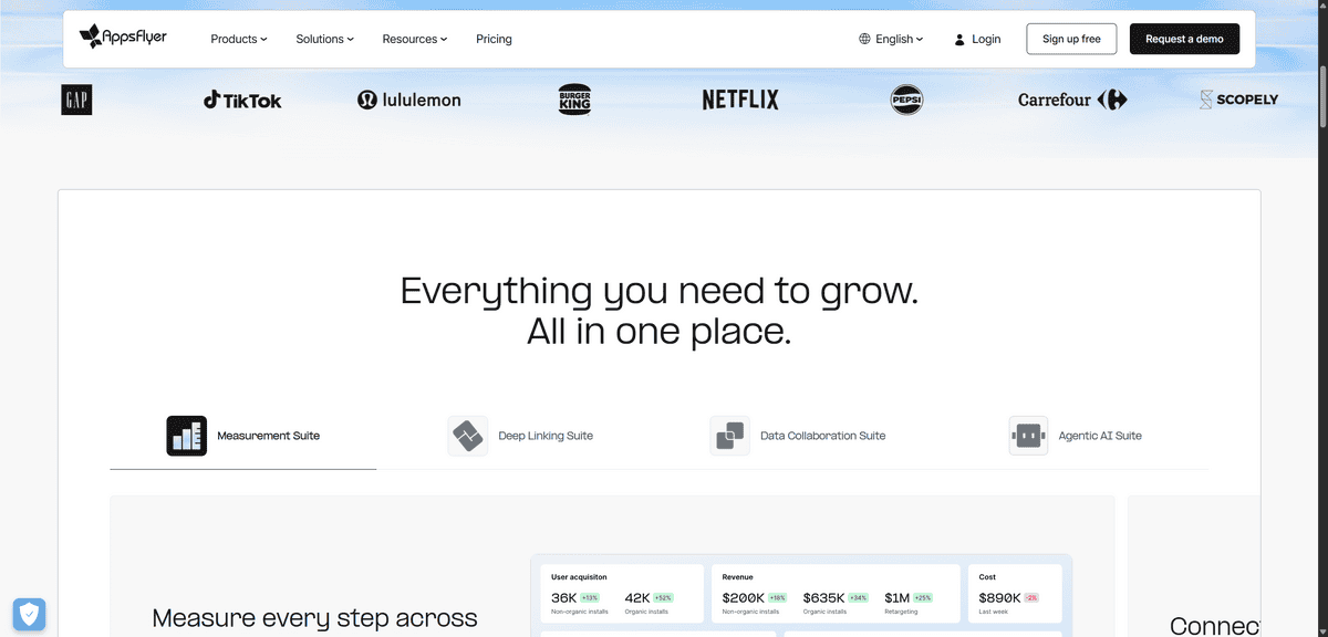
AppsFlyer
Feature | Details |
|---|---|
Best For | Mobile app attribution and campaign tracking |
Pricing | Free “Zero” plan for small apps, custom pricing at scale |
Key Features | App install attribution, ROI analysis, fraud protection, 10,000+ partner integrations |
Free Plan | Yes – free for apps under 12,000 lifetime non-organic installs |
When you’re running a mobile app and spending money on advertising, you need to know which campaigns actually drive installs and valuable users. That’s exactly what AppsFlyer does, and it does it better than anyone else in the market. This is the attribution platform that mobile-first companies depend on to connect every marketing dollar to a real outcome.
What makes AppsFlyer different is that it solves a problem the other analytics tools on this list don’t even address. General web analytics tools show you what happens inside your app once someone’s there. AppsFlyer tells you what happened before they installed. Which ad, which channel, which campaign, and which creative brought each user to your app store page and converted them into an install. AppsFlyer holds an estimated 75% market share in mobile app attribution, and its SDK leads Android app attribution with 48.51% integration reach as of early 2024.
Think about what happens when you’re running campaigns across Meta, Google, TikTok, and programmatic networks simultaneously. Without attribution data, you’re guessing which channels work. With AppsFlyer, you know exactly which campaign drove each install, how those users behave inside the app after installing, and which channels produce users with the highest lifetime value. That data directly drives where you should increase and cut ad spend.
The platform integrates with over 10,000 technology partners and major advertising networks, giving you centralised ROI data across your entire media mix. The built-in fraud protection is also significant for startups, protecting your ad budget from install fraud which is a real and costly problem in mobile marketing.
But here’s what you should know: AppsFlyer is specifically designed for mobile app marketing. If you’re building a web product without a mobile app, or if you’re pre-monetisation and not running paid user acquisition yet, this tool adds complexity without adding value. The setup requires SDK integration by your engineering team.
This tool works best for mobile-first startups running paid user acquisition across multiple channels who need accurate, unbiased attribution data to optimise their spend. It’s less ideal for web-only products or for startups that are purely organic at this stage of growth.
CLEAN PRIVACY-COMPLIANT WEB ANALYTICS
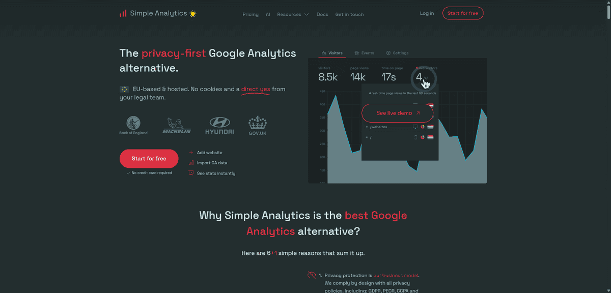
Simple Analytics
Feature | Details |
|---|---|
Best For | Clean, privacy-compliant web analytics |
Pricing | From $9/month (free trial available) |
Key Features | No cookies, no personal data, instant setup, GDPR and CCPA compliant |
Free Plan | No – paid only, but free trial included |
If you want web analytics that respect user privacy without the complexity of Google Analytics, Simple Analytics lives up to its name entirely. This tool gives you the essential website metrics you need in a clean dashboard that anyone on your team can understand, with no cookies, no personal data collection, and no legal overhead.
What makes Simple Analytics different is the deliberate scope of what it does. You’re not getting a sprawling platform with hundreds of reports. You’re getting page views, unique visitors, referral sources, top pages, device breakdowns, and conversion events, presented in a dashboard so clean that you can get what you need in under a minute. There’s no configuration, no custom report building, and no need to read documentation before your data is useful.
Think about the scenarios where this matters for a startup. You’re launching a privacy-first SaaS product, and asking your users to accept tracking cookies contradicts your brand positioning. Your team is tiny, and you can’t afford to have your marketing lead spend an afternoon figuring out GA4. Or you’re selling to European enterprise customers for whom GDPR compliance in your own tooling is a prerequisite for the relationship. Simple Analytics handles all of these situations cleanly.
You can import your existing Google Analytics data to keep your historical baseline when switching, share reports with your team through scheduled emails or direct links, and start analysing data from the moment the single script is installed. The automated GDPR, CCPA, and PECR compliance means you never have to think about consent banners or data processing agreements for your analytics layer.
But here’s what you should know: Simple Analytics doesn’t have the advanced features of Google Analytics or product analytics tools. You won’t get detailed user behaviour tracking, complex funnel analysis, or integration with advertising platforms. The focus on simplicity is the product’s strength, but it’s also its ceiling. If you need to go deep on user journeys or connect campaigns to conversions, you’ll need a more capable tool.
This tool works best for content sites, early-stage products, and teams that value speed and clarity over analytical depth. It’s also a strong choice if you’re running Plausible but want slightly different pricing or feature packaging. It’s less ideal once your analytics needs outgrow the basics.