[Reader Disclosure]Our content is reader-supported. This means we may earn a commission if you click on some of our links.
Whether you’re a small business owner, entrepreneur, or hobbyist, if you’re running a startup, you all have something in common – you’ll need a startup website.
It is the first touchpoint for investors, customers, potential partners and media.
And it just takes half a second for a user to form an opinion about your website’s design. This means you have an incredibly short time window to capture a user’s attention and convey trust, credibility, and relevance through your startup website.
But launching your startup website can be difficult if you lack experience or are not a designer.
But fret not, we went through thousands of startup websites to come up with the twelve best startup websites to help you find inspiration on not just design but also copywriting, accessibility, user experience etc.
Before we show you the top startup websites, it’s important to understand the key factors we used to evaluate them. We took an in-depth approach to ensure that these websites not only stand out but also provide significant value to their users.
Here are the key factors on which we have evaluated the websites:
Design: How visually appealing and user-friendly is the website? That’s not it; how target audience-centric is the startup website?
Copywriting: Does the website’s copy convey the brand’s message in the first go? Is it good enough to engage and persuade users?
UX: How intuitive is the website? Is it easy to navigate and find information on the site?
Accessibility: Does the website follow accessibility standards, making it inclusive for all users regardless of their abilities? Does it adhere to all levels of accessibility to ensure a seamless experience for all?
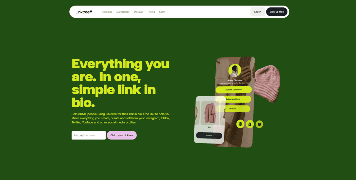
LinkTree
Linktree is a link-sharing tool (link-in-bio tool) for social media users. It lets you make a simple page with many links. This page can be shared on social media profiles and can include links to your other social accounts, websites, or products you sell.
The main users of Linktree are content creators and businesses active on social media platforms like Instagram and TikTok. The startup aims to solve their problem of limited link space on such platforms.
What We Liked About Linktree’s Website?
Linktree’s website has a sleek design and user-centric approach. The domain “linktr.ee” is clever and memorable, conveying the brand’s purpose.
Since the target audience is generation z and creator audience, the vibrant colour scheme suits it well.
Even the concise copy “Everything you are. In one, simple link in bio” clearly communicates the product’s value proposition.
We loved the straightforward CTA, inviting users to claim their Linktree link without requiring immediate sign-up (in above the fold).
The below-the-fold content efficiently conveys the create-share-monitor process, and the testimonials from high-profile users boost credibility.
Although accessibility options could be improved, the site’s intuitive navigation and strong SEO performance, driving 9 million monthly visitors, demonstrate that it’s worthy to be at the top of best startup websites.
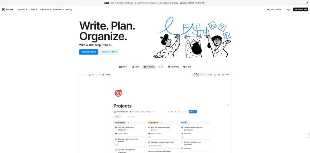
Notion
Notion is a flexible AI-powered digital workspace tool that combines various productivity features into a single platform. It serves as an all-in-one solution for individuals and teams, offering capabilities for creating wikis, managing documents, and organising projects.
It’s a blank page where you can do almost anything – build a webapp, sell digital assets, create a to-do list, or just add SOP for your team.
The main users of Notion are individuals, teams, and organisations looking to streamline their workflows.
Its USP lies in its flexibility and integration of multiple functionalities, allowing you to create customised workspaces that suit your needs.
Notion easily replaces multiple separate apps by providing a centralised platform for note-taking, task management, collaboration, and knowledge sharing.
What We Liked About Notion’s Website?
Notion’s website impresses with its clean, minimalist design that perfectly aligns with its target audience of productivity enthusiasts.
The no-frills copy, “Write. Plan. Organise. With a little help from AI,” immediately conveys the brand’s core message.
We appreciated the clear, visible CTAs above the fold, guiding users to take action.
The site’s layout is intuitive, with dedicated sections showcasing the product’s features through supporting screenshots. The clever use of testimonials, like the Forbes sticky note proclaiming “Your AI everything app,” adds credibility.
The consistent blue CTAs with varied copy throughout the site encourage account creation without being overwhelming. It is something most designers forget to do.
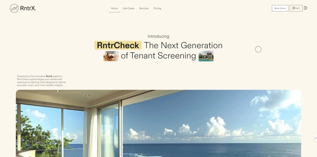
RntrCheck
RntrCheck is a tenant screening service for property managers and landlords. It offers background checks on potential renters to help protect properties and profits. The tool aims to give a full view of each applicant.
The main users of RntrCheck are property owners and managers. They use it to assess rental applicants and make informed choices about tenant selection. The service likely includes credit checks, criminal background searches, and rental history checks, though specific details are limited in the provided information. RntrCheck offers both online tools and customer support, with options to contact them by phone or email.
What We Liked About Rntrcheck Website?
RntrCheck’s website has both user-centric design and compelling copywriting.
We loved the concise, readable text with bold headlines and bullet points, making it easy for property managers and landlords to grasp the service’s value proposition.
The professional language and direct tone effectively communicate the platform’s offerings top the intended target audience.
The strategic placement of clear CTAs like “Book Demo” and “Start screening today” guides visitors towards action smartly.
Visually, the modern design with a unique cursor and subtle pastel colour scheme fosters trust and engagement.
The consistent use of circular elements across folds reinforces this trust-building aesthetic.
Each section adds tangible value to the reader, demonstrating a thoughtful approach to content organisation and user experience.
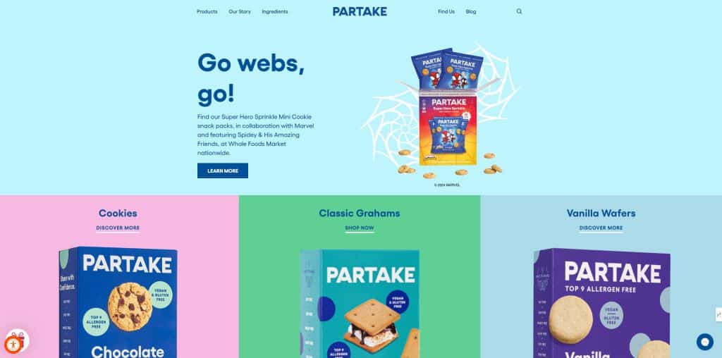
Partake Foods
Partake Foods specialises in allergy-friendly snacks and baking products. Founded in 2016 by Denise Woodard, the company was created after Woodard’s daughter was diagnosed with multiple food allergies. Partake Foods aims to provide safe and delicious options for people with and without food restrictions.
The company offers a range of products including cookies, baking mixes, and pancake & waffle mixes. All of Partake’s offerings are certified gluten-free, non-GMO, vegan, and free from the top 9 allergens (wheat, tree nuts, peanuts, milk, eggs, soy, fish, sesame, and shellfish). This focus on allergy-friendly foods addresses a significant need, as food allergies affect 1 in 13 children in the United States.
What We Liked About Partake Foods Website?
Partake Foods’ website expertly balances aesthetics with functionality, catering perfectly to its allergy-conscious audience.
The product pages shine with their accessible, logically structured layout and engaging descriptions.
We loved the compelling “Our Story” section and the vibrant colours that reflect the brand’s fun personality.
The landing page efficiently presents crucial information about allergens, ingredients, and products.
The accessibility toggle is a standout feature, offering options like larger text, bigger cursor, and colour inversion, demonstrating Partake’s commitment to inclusivity.
This thoughtful design ensures a seamless experience for all users, regardless of their abilities, while effectively conveying the brand’s message of safe, delicious treats for everyone.
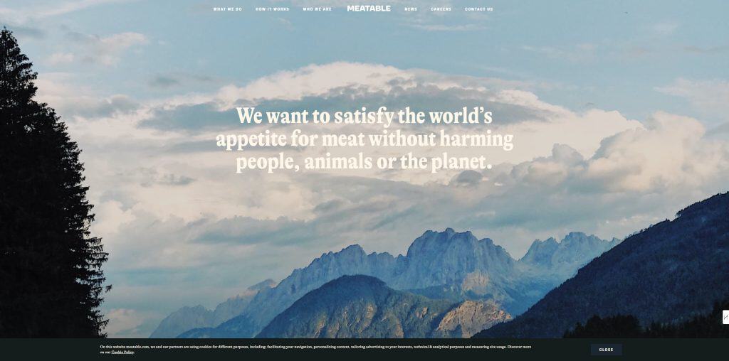
Meatable
Meatable is a foodtech startup that makes lab-grown meat. They use stem cells from animals to grow real meat without harming them.
Their goal is to create meat that tastes the same as traditional meat but is better for the environment.
Meatable’s main selling point is their fast production process. They claim they can make meat in just 8 days, which is much quicker than other companies.
What We Liked About Meatable Website?
Meatable’s website masterfully blends visually appealing design with compelling copywriting to convey its innovative approach to cultivated meat. The imagery, featuring idyllic farm scenes and natural colours, reinforces their “new natural” concept, effectively targeting eco-conscious consumers.
We loved the comprehensive FAQ section, addressing potential concerns upfront. The intuitive navigation seamlessly guides users through key sections like “What We Do” and “How We Work,” enhancing the overall user experience.
The copy is particularly strong, using phrases like “A new natural process” to engage and persuade.
While the website excels in many areas, improving text contrast against background images could enhance accessibility.
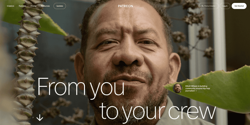
Patreon
Patreon is a monetisation platform for content creators. It lets artists, writers, musicians, and other creators earn money from their fans. Fans can pay a monthly fee to support their favourite creators. In return, they get access to exclusive content or perks.
Patreon’s main selling point is that it provides a steady income for creators. Unlike ads or one-time sales, Patreon offers ongoing support. This allows creators to focus on making content rather than chasing sponsors. However, creators need to build and maintain a loyal fan base to succeed on Patreon.
What We Liked About Patreon Website?
Patreon’s website impresses with its innovative design, featuring an interactive cursor that acts like a scratch card, cleverly mirroring the platform’s premise of revealing exclusive content.
The layout is complemented by smart persuasive copywriting that effectively communicates the brand’s value proposition.
Phrases like “For your real fans” and “Your wildest creative reality” immediately capture the essence of its offering.
The well-organised structure with clear navigation categories enhances user experience, making it easy for both creators and patrons to find relevant information.
The site’s engaging content and segmented sections cater effectively to its target audience of creators and their fans. While the scrolling issue on certain browsers is a minor drawback, overall, Patreon’s website successfully combines aesthetics, functionality, and compelling messaging to create an inviting platform for creative communities.
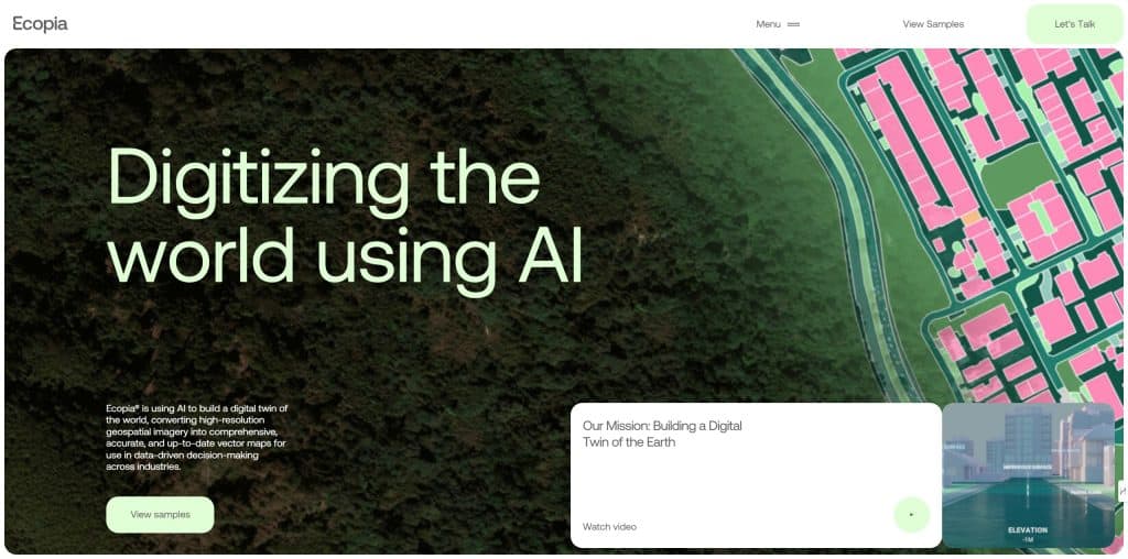
Ecopiatech
Ecopia AI is a geospatial mapping company that uses artificial intelligence to create detailed digital maps. They turn satellite and aerial images into vector maps that show buildings, roads, and land features. These maps help governments, businesses, and organisations make decisions about urban planning, disaster response, and environmental management.
The company serves clients who need accurate and up-to-date maps of large areas. Their main selling point is that they can map vast regions quickly and with high precision using AI. This saves time and money compared to traditional mapping methods. Ecopia AI’s maps are used in various fields like telecommunications, insurance, and humanitarian aid.
What We Liked About Ecopiatech Website?
Ecopia AI’s website has a clear and compelling copy, effectively communicating its value proposition through phrases like “Digitising the world using AI.”
The clean, modern design is visually appealing and user-friendly, catering well to its target audience of industry professionals.
The site’s intuitive navigation and well-organised information architecture enhance the user experience, making it easy to explore their services and case studies.
We liked the rich text content, which not only provides comprehensive information but also enhances accessibility for users with visual impairments.
The inclusion of multiple news articles and case studies adds credibility and showcases real-world applications of their technology, effectively engaging and persuading potential clients. These features make Ecopia AI’s website a standout among the best startup websites.
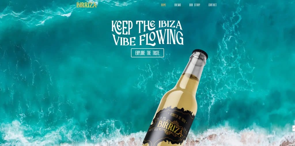
Birriza
Birriza is a beer company based in Ibiza. They make local beers that aim to capture the island’s spirit. Their drinks are light and refreshing, meant to be enjoyed in the sunny climate. Birriza wants to bring a taste of Ibiza to beer lovers everywhere.
The startup serves tourists and locals who want to try Ibiza-inspired beers. Their unique selling point is the connection to the island’s culture and lifestyle. Birriza offers a way for people to experience Ibiza through their beverages, even when they’re not on the island. They focus on creating beers that match the relaxed and fun atmosphere Ibiza is known for.
What We Liked About Birriza Website?
Birriza’s website immediately transports you to a sun-soaked Ibiza beach with its vibrant design and inviting copy.
The tagline “Sip into happiness with Birriza!” perfectly captures the brand’s essence, while phrases like “locally crafted” and “island’s unique spirit” reinforce its authenticity.
The clean layout and ample white space create a refreshing, user-friendly experience that mirrors the lightness of their beer.
We liked the prominent “KEEP READING” call-to-action, guiding visitors to explore more. The colour palette of blues and whites evokes a coastal feel, cleverly tying into the product’s origins.
While accessibility features weren’t immediately apparent, the overall design and copywriting successfully convey Birriza’s brand message, making you almost taste the “light, refreshing” beer through the screen.
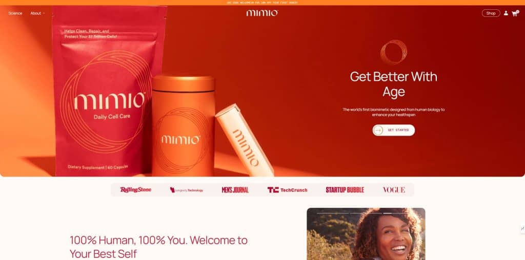
Mimio Health
Mimio Health is a nutraceutical startup that makes supplements. They sell a product called Mimio that aims to copy the effects of fasting. The company says their supplement can help with things like hunger control, energy, mood, and healthy ageing.
They claim it works by activating the body’s natural processes that happen during fasting. Mimio Health targets people who want the benefits of fasting without actually fasting.
Their main selling point is that you can take their supplement with food and still get fasting-like effects. The company says their product is based on research into fasting biology. They market Mimio as a way to support cellular health and longevity without changing your diet.
What We Liked About Mimiohealth Website?
Mimiohealth’s website impresses with its intuitive design and compelling copywriting. The above-the-fold copy, “Get Better With Age,” immediately captures attention, while the subheader emphasises the product’s scientific foundation.
The red colour palette exudes energy and aligns perfectly with the brand’s focus on cellular health. We appreciated the smart sticky CTA featuring the product and “Add to Cart” button, making purchasing easy.
The copy strikes a balance between informative and engaging, effectively conveying the premium nature of Mimio’s offerings.
The clean design maintains excellent visual hierarchy, while the easy navigation with prominent “Science” and “About” buttons enhances user experience.
The website’s focus on a single product is well-executed, showcasing its benefits and scientific backing through research stats and ingredient explanations, which builds trust and credibility. These elements contribute to making Mimio Health’s site a strong contender among the best startup websites.
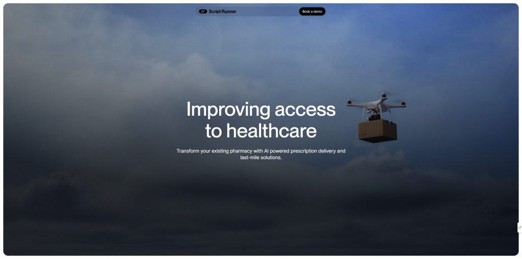
Scriptrunner.ai
ScriptRunner.ai is a software company that helps pharmacies deliver prescriptions. They make a tool that lets pharmacies manage and track deliveries more easily. The software can work with a pharmacy’s own drivers or use ScriptRunner’s delivery network.
ScriptRunner.ai aims to save time for pharmacists so they can focus more on patient care. Their system handles payments and follows health data rules. They say their tool can help pharmacies offer faster service and reduce errors in deliveries.
What We Liked About Scriptrunner Website?
ScriptRunner.ai showcases a clear and compelling value proposition, immediately conveying its purpose in transforming pharmacies with AI-powered prescription delivery.
The site’s clean, professional design and intuitive navigation create a user-friendly experience tailored to its target audience. We appreciated the effective use of a background video blending tech and healthcare visuals, reinforcing the brand’s innovative approach.
The copywriting is concise yet persuasive, highlighting specific benefits like labour savings and error prevention. The logical segmentation of key sections, strong visual hierarchy, and sticky “Book a Demo” CTA enhance user engagement.
The website effectively balances information delivery with a sleek, modern aesthetic, making it both visually appealing and functionally robust for potential clients in the healthcare sector.
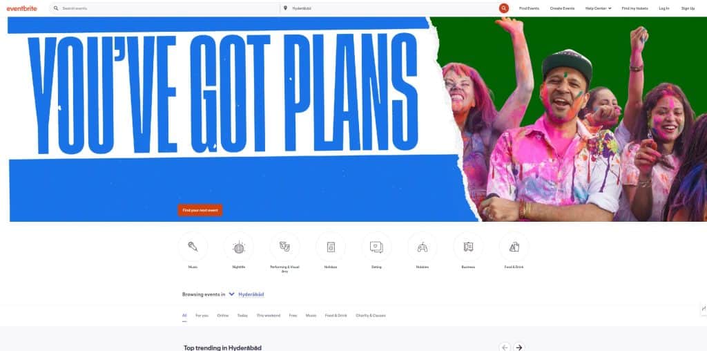
EventBrite
Eventbrite is an online ticketing platform. It helps people create and sell tickets for events. Users can make event pages, set ticket prices, and track sales. Attendees can find and buy tickets to local events through the site.
The company serves both event organisers and attendees. Organisers use it to manage their events and sell tickets. Attendees use it to discover and attend events in their area. Eventbrite’s main selling point is its ease of use for both groups. It offers a simple way to handle all aspects of event ticketing in one place.
What We Liked About Eventbrite Website?
Eventbrite’s website has an exceptional user-centric design and intuitive navigation. The clean, minimal layout immediately draws attention to key actions: “Find Events” and “Create Events,” catering to both event-goers and organisers.
We liked the smart event categorisation (music, nightlife, arts) and location-based filtering, enhancing user experience.
The copywriting is concise and persuasive, effectively communicating the brand’s value proposition.
The use of contrasting colours, clear typography, and well-structured content makes information easily digestible.
The website’s seamless navigation and attention to detail make it one of the best startup websites, as it effortlessly serves the needs of its diverse user base.
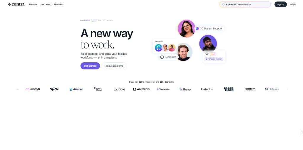
Contra
Contra is a freelance platform that connects independent professionals with clients. It aims to simplify the process of finding and hiring freelancers for various projects.
Contra’s main feature is that it doesn’t charge commission fees to freelancers, allowing them to keep all their earnings.
The platform serves both freelancers and businesses looking for talent. Freelancers can create profiles, showcase their skills, and find work opportunities. Clients can use Contra to discover and hire experts for their projects, manage payments, and handle contracts. Contra’s unique selling point is its focus on being commission-free for freelancers while providing a range of tools for project management and payments.
What We Liked About Contra Website?
Contra’s website has a minimalist design that perfectly caters to both remote hirers and freelancers. The strategic placement of testimonials above the fold immediately builds trust, effectively competing with industry giants.
We loved the clear, columnised presentation of key statistics, such as the “1 day avg. time from contract to kick off” and “50% savings hiring flexible talent.”
The homepage’s ability to address all three target audiences is a masterstroke in user-centric design.
Vivid, attention-grabbing elements ensure thorough engagement, while personal freelancer testimonials add authenticity.
The inclusion of hiring guides demonstrates Contra’s commitment to user success.
The copy is concise yet persuasive, effectively conveying the brand’s value proposition.
Navigation is intuitive, with easy access to essential information, making the overall user experience smooth and accessible.
A startup consultant, digital marketer, traveller, and philomath. Aashish has worked with over 20 startups and successfully helped them ideate, raise money, and succeed. When not working, he can be found hiking, camping, and stargazing.
Each week I share research backed AI oriented content in my newsletter.
There are AI ideas, AI trends, tutorials, and guides.
24k entrepreneurs read it. I'd love you to join.


")


