You can see it right from the corner of the block. That storefront. The sign in clean yet warmly inviting colours, the lovely summer dresses in the window.
You walk in.
There are wooden accents throughout, from the shelves to the ceiling décor, and the backdrop is white with green plants dotted about. There’s the scent of lavender in the air.
You feel calm and content, and stroll around.
The summer collection is just in; you see at least five dresses you like on the hangers.
Near the changing room is a stand with handbags on display.
That brown tote will look wonderful in the afternoon. You emerge with the dresses that fit and grab the tote.
Turn the corner and you see a wooden park bench with shoes displayed on it.
Those platform heels are so pretty! Luckily they have them in your size.
You pay at the cash counter, pausing to pick up a pair of earrings displayed by the cash register.
On your way out, you catch a whiff of something strong and invigorating.
What’s that counter offering? Free coffee tastings? You’re up! That roasted Brazilian brew is out of this world. You should probably grab a packet for those early mornings.
You step out of the store, laden with shopping bags, and walk home with a spring in your step.
Congratulations. You’ve just become a successful catch of visual merchandising.
What Is Visual Merchandising?
Visual merchandising is the process by which retailers make their store spaces more attractive to customers so as to prompt them to make a purchase.
Also referred to as visual retailing, visual merchandising is about presenting an appealing display and store space to customers that will attract their interest and encourage them to stay longer and buy more in the store, even if they had not originally planned to buy anything. By providing different kinds of visual cues, a retailer can evoke the desired emotions in a customer to translate into a sale – be it urgency, impulsive temptation, contentment or seasonal vibes, depending on what the store is selling and the experience it wants to create.
Visual merchandising, in fact, goes far beyond the visual impact and creates a multi-sensory experience that incorporates physiological as well as psychological triggers to stimulate purchase. Colours, lights, smells and even sounds can have a profound impact on the buyer’s state of mind and can prompt the buyer towards a decision, whether a yes or a no. Done correctly, visual merchandising can stimulate awareness, create customer loyalty, elevate brand image – and, of course, boost sales.
Essential Elements Of Visual Merchandising
Retailers who are new to visual merchandising may feel overwhelmed by what it implies.
“Does it mean I need to throw out everything and build a new store that looks nicer? And what do you mean by nicer, anyway?”
There is, of course, no need to build a new store – in fact, visual merchandising is all about using the existing space in a more creative way. With regard to the elements of good visual merchandising, we can classify them under three main heads – store layout, store ambience and store narrative.
Store layout
This is the skeleton of your store: the display outside, the basic structure, the way you use your available space. This forms a backdrop to the themes and special features you add later and gives customers a reason to browse your store in the first place. There are four main elements of store layout.
Signage & Window Display
If a customer doesn’t like the outside of your store, chances are they won’t step in. Visual merchandising begins with designing an attractive exterior that gives the shopper a glimpse of what the store offers and tempts him or her to walk inside. Whatever your product is, use the window display to highlight it with the help of good lighting and complimentary decorations. With outdoor gear, for example, you can place a hat on a display surrounded by artificial leaves and have a forest-themed backdrop to it. Kate Spade took their display up an extra notch by converting it into a shoppable window where browsers could order products by scanning them with their phones. In addition, ensure your store sign is clearly visible, readable from a distance and designed in the colours and patterns you want customers to associate with your product. Almost 8 in 10 shoppers say they would enter a store based on its sign, so make yours stand out.
Product Display
This requires making strategic use of the available space to create a display that attracts without distracting. For clothing and other retail stores, this revolves largely around how you arrange your products. A circular layout tends to expose customers to more merchandise as compared to traditional aisles. If you use aisles, set up display areas that highlight your signature products so that shoppers pause to look. Cash counters are great for displaying impulse buys like jewellery, chocolates or fridge magnets. You can also consider redesigning your store space so as to make it more open or to draw customers to some central point. Goose Island brewery in Chicago, for instance, redesigned its store concept to make use of open spaces, open up brick walls to integrate seating areas and allow customers a direct view into the brewing process.
Focal points
You need a display that’s pleasant overall, but you also want to draw the customer’s attention to certain things. Do that by creating a focal point. It can be as simple as a brightly pattered tea-set on a plain wooden table, or as complex as a seaside-themed section complete with sand and seashells to display a swimwear line – the crucial point is that it needs to be a draw. It’s commonly said in marketing that where the eyes go, the feet follow – and well-designed focal points can boost your sales by as much as 229%.
Empty spaces
It is for good reason that the saying goes “less is more”. Use empty spaces to add wall murals or lifestyle graphics that provide information about your products or simply feature evocative images. In a luxury chinaware shop, for instance, the picture of a well-dressed woman in an opulent setting conveys the image of luxury that the store wants to associate with its chinaware. You can also feature quotes, blocks of text or abstract art on your walls.
Store Ambience
This is what creates the sensory experience for the customer. While the store layout creates the immediate visual impact, the ambience heightens that by appealing to the visual (sight), auditory (sound) and olfactory (smell) senses to capture the customer’s attention.
Colour
There’s an entire body of research on colour psychology and its applicability to marketing, and for good reason. Ever wondered why so many fast-food brands, from McDonald’s to KFC to Chili’s, use red so generously in their branding? Red evokes hunger and is an instant draw. (So the next time you binge on fried chicken, you can blame psychology.) Green calls to mind the serenity of nature and speaks of a natural, wholesome, soothing experience, and is used very effectively by Whole Foods. Black, on the other hand, denotes sophistication and class – which is why it is a favourite with high-end designer brands like Chanel and Dolce & Gabbana.
Lighting
Up to one-fourth of customers can make an impulse purchase on the basis of correctly done store lighting. And we don’t just mean regular illumination – stores can up their visual game immensely by using dynamic lighting, which involves the intensity, colour, direction and movement of light that stimulates a shopper to make a purchase. To draw attention to a product, shine an incandescent light on it and keep the surrounding areas relatively dim. Colours again play an important role in influencing a shopper’s mood, with blue shades creating a relaxed feel and reds sparking excitement. When shedding coloured light on a product, ensure that it matches the shade of the product to avoid clashing – a sea-green light on a turquoise green product, for instance.
Sound
Ever walked into a store and felt that the music was too distracting? Every store needs to have a playlist that reflects the mood of the products and draws customers further in. An organic food store, for example, could play soothing lounge music or oceanic sounds. A teen clothing store, on the other hand, can play the latest pop songs.
Smell
we’re not talking about basic freshness here: every five-year-old knows that if a place smells like unwashed feet, it’ll empty out pretty soon. We’re talking about the positive stimulation of the olfactory nerve to tempt your customer into a long, lingering store visit that culminates in a purchase. Given that our mood may improve by as much as 40% when we encounter a pleasant smell, you should certainly consider investing in a quality aroma for your store. A shop that sells natural body care products, for instance, can entice shoppers with the smell of essential oils. A men’s clothing store can have a subtle musky fragrance, while a kitchenware store could smell of freshly baked bread. And a café, of course, should smell invitingly of freshly roasted coffee.
Store narrative
What is the story your shop space tells? Your layout and ambience may be technically on point, but if your store space doesn’t come together in a cohesive narrative, it won’t be able to retain and bring back customers that well. Use store themes to complement your product – think of the theme as a 3D moodboard that shows how you want shoppers to see the product.
Store Theme
Your settings are an extension of your products. Design them wisely so as to create the mood you want customers to associate with your product. The straight lines, sharp edges, neutral colours and empty spaces of minimalism create a refreshingly simple environment and allow shoppers to focus on the product. Again, other stores might choose to go big and bold. Hershey’s Chocolate World in New York, for instance, brings to life the New York experience with a Hershey’s twist – from a recreation of a Thanksgiving Day parade to a Central Park-themed corner with a camper truck dispensing s’mores, the store immerses customers in the Hershey’s way of life from the moment they step in.
Seasonal Theme
Whether it’s spring break or Thanksgiving, shopping sprees will surge and you want to capitalise on that. Decorate your stores with the right banners, posters and baubles that bring out the spirit of the season, and adjust the music to suit the mood too. Christmas, for instance, can be celebrated by putting up a Christmas tree, adding red-and-white decorations, spraying the air with cinnamon and playing classic Christmas hits.
Extras
Everyone loves free stuff. Use the power of extra bonuses and complementary facilities to enhance the experience for your shoppers. For example, you could serve free coffee or juices to customers trying on clothing. You can also have counters where you feature different vendors and their free samples/tastings each week. Interactive sections are a huge draw as well – MAC Cosmetics, for instance, recently launched a Virtual Try-On Mirror that allowed customers to see what different make-up products would look like on their skin.

Visual Merchandising Examples
Visual merchandising has long been recognised as an important strategy to distinguish oneself from the rest of the market. Fashion and lifestyle brands frequently use attractive displays and appealing store themes to create the right setting for their products, while restaurants devote much of their planning efforts towards designing their ambience. However, visual merchandising isn’t just for fashion and dining any more. Businesses of all kinds are recognising the value in an attractive store space, and are renovating themselves to create a new experience for customers as these brands are.
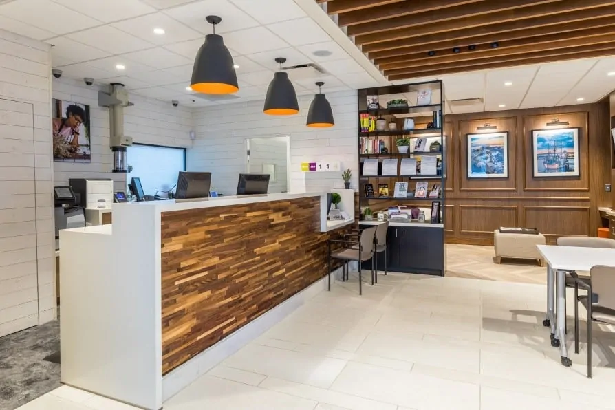
- Chelsea Groton Bank, Groton, USA – when you think of a bank, you normally think of a dull, austere space with long grey counters and uncomfortable chairs. Connecticut’s Chelsea Groton Bank, however, redesigned their space to become a bank where people would come to learn and understand banking along with availing of regular bank services. With a large lobby, attractive wooden details, comfortable private seating areas and a more open space to facilitate side-by-side interactions, Chelsea Groton created a flexible, welcoming space that is, in the words of design principal James Farnell, all about “un-banking the bank”.
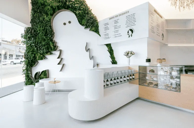
- Coffee For Sasquatch, Los Angeles, USA – this LA coffee shop does the seemingly impossible by blending minimalism with the warm and quirky. Customers step into the café to enter a world of natural light, clean colours, abstract art and the floor-to-ceiling Sasquatch depiction. The use of various materials and surfaces created a minimal space where all the elements are cohesive, and there is still the warmth of greenery and wooden touches. The coffee shop won the award for Retail Renovation of the Year 2018 by VMSD, and makes a statement that passers-by can’t help but be attracted to.
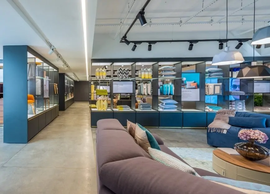
- Script, Bengaluru, India – this stunning home furnishings store by Godrej & Boyce Mfg. Co. Ltd was designed with the aim of appealing to the growing Indian millennial classes with largely Westernised tastes and a modern outlook. The store was thus designed along the lines of an art gallery, with an open-floor layout that let the furnishings speak for themselves and spaces that paid homage to the product designers. Brass details were incorporated throughout the store as a tribute to the company’s legacy as a lock manufacturer, and the storefront was designed to adapt to natural light and also have a backlit display at night.
Visual Merchandising For Online Businesses
It is easy to assume that visual merchandising is exclusively the domain of brick-and-mortar retailers who have an actual physical space in which to wow the senses. However, think about the last online store you browsed. What did the page layout look like? What were the colour schemes? Was the site easy to navigate? Was the content crisp and catchy? Were the products displayed in high resolution and with enough information? Was the checkout process easy and smooth? All these are as much exercises in visual merchandising as are mood lights and free coffee. While tactile, auditory and “smell” experiences aren’t currently possible with online selling, retailers can use visual elements to impress customers the moment they walk in, as these successful sellers are doing:
- Hyphen Sleep – This mattress brand uses a homepage with a clean design and bright pops of colour to tell its story. The homepage contains all the necessary details to convince a prospective buyer – product features, testimonials, price competitiveness and useful tips – without cluttering the page. It uses a neutral palette with splashes of orange and blue to attract the viewers, and the images of happy sleepers are evocative.

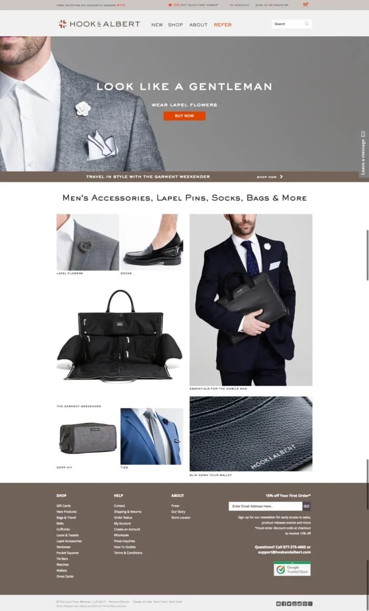
- Hook & Albert – this accessories and leather goods brand from New York makes use of a collection format to showcase its goods. This format is inspired by the collection boards on Pinterest and is popular for highlighting clothing, accessories and other lifestyle goods. A simple grid layout makes for a clean look, and high-quality images with bold captions grab the attention of the viewer. A minimalistic backdrop ties in with the theme.
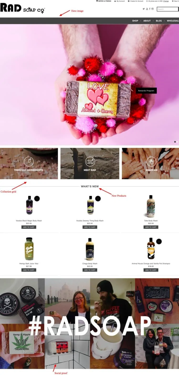
- Rad Soap Co. – this soap brand makes use of collections as well as a feature-based format that highlights certain “hero” products while also allowing customers to explore the collections they are interested in. An entire section is devoted to social proof, where social media posts with the #radsoap tag are featured.
Starting With Visual Merchandising
Whether you’re a seasoned retailer or just starting out, effective visual merchandising can go a long way in making your store more memorable. Giving your store a makeover, however, can be an expensive and complicated task. It’s important to be well-prepared before starting out so that you and your team have a clear idea of what you want your store to look and feel like to customers. You can start off by following three simple steps.
- Design a planogram – a planogram is a diagram of your store layout that depicts what elements you want to put in and where. Prepare a planogram for your store as it is first, and then see how you can improve it. Can you relocate items to make them appear less cluttered? Can you realign furniture to create more open spaces? Where can you add lighting, decorations, wall murals, shelves, display stands etc. to enhance the layout? What colour schemes will you go for and how will they be distributed? If you have an online store, come up with similar plans for each of your webpages. Narrow down to a final set of ideas, as well as one or two backup plans in case the original one doesn’t work out.
- Allocate a budget – redecorating a store can be expensive, especially for a new business. With your planogram as a reference, determine how you can implement the desired changes at the most reasonable rates. Wherever possible, see how you can reuse what you already have or give existing furniture a facelift so that it fits in with your new theme. For online stores, allocate an amount for a seasoned web designer who can give your website the upgrade you desire.
- Keep the team in sync – It is essential that your team, particularly your shop-floor staff, are aware of the new theme of the store. This way, floor staff can guide customers to focal points and take them through the narrative of the store space – it also reduces the risk of staff members rearranging exhibits or shifting the displays on their own. You should also have a system in place by which your team can share and discuss new ideas for visual merchandising. For an online store as well, it is important that the team in charge of site content, graphics and maintenance is aware of the store theme so that it can make updates and share new content accordingly.
Bottom line?
Humans are visual creatures. We gravitate naturally towards the aesthetic. Our tendency to be loyal to a brand depends on how well we can relate to the brand starting from the first impression – there is thus a clear case to be made for investing maximum effort in good visual merchandising. However, too elaborate a display could end up confusing the customer and putting them off further browsing. As a retailer, therefore, you need to use your store space strategically so as to expose customers to the maximum amount of merchandise while providing enough empty space to browse and reflect, and use a multisensory experience that ties in with your theme and convinces your customer to stay. While this could take a little time to perfect, the payoff in terms of customer loyalty and sales per square foot will be more than worth it.
After all, you can never go wrong with a good makeover.
Go On, Tell Us What You Think!
Did we miss something? Come on! Tell us what you think about our article on visual merchandising in the comments section.
I’m always up for a party. In a library. With unlimited brewed coffee. And Chopin on the playlist.
![What Is Visual Identity? [Detailed Guide] visual identity](https://www.feedough.com/wp-content/uploads/2022/09/visual-identity.webp)
![What Is Green Marketing? [The Complete Guide] green marketing](https://www.feedough.com/wp-content/uploads/2018/11/green-marketing.webp)
![Font Psychology For Logo Design [Complete Guide] font psychology](https://www.feedough.com/wp-content/uploads/2016/10/font-psychology-10.webp)