[Reader Disclosure]Our content is reader-supported. This means we may earn a commission if you click on some of our links.
Customers believe what they see. In fact, studies show that over 92.6% of customers put the most importance on visual factors while purchasing a product. This is because humans are innately wired to process visuals 60,000 times faster than text.
And this visual processing power of our brain is what marketers exploit to create a connection with their target audience. This connection is built through a carefully designed process, which we call visual identity.
But before we get into the details of visual identity, let’s first understand what it is and what it entails.
Visual identity is the set of unique visible elements and characteristics that visually define and communicate a company’s brand message.
Also commonly known as visual branding, visual identity is an umbrella term that includes all the elements contributing to how a company is perceived visually. This consists of the logo, colour palette, typography, imagery, packaging design, label etc.
In simple words, visual identity is what makes a brand recognisable with just a glance.
For example, when a person sees a yellow ‘M’ on a red background, they instantly think of Mcdonald’s. That’s Mcdonald’s visual branding.
The Importance Of Visual Identity
Visuals are essential for customers to recognise and differentiate a brand effectively. In fact, over 90% of the information transmitted to the brain is visual.
Hence, a strong visual identity is essential for a brand to:
Personify the brand: A visual identity gives a human-like personality to a brand and makes it more relatable to customers.
Build an emotional connection with the customer: Visuals leave a lasting impression on customers and help them connect with the brand on an emotional level.
Create brand recall: A strong visual identity helps customers better remember a brand and its products/services.
Build trust and credibility: Customers are more likely to trust a company whose identity matches their perceptions and beliefs.
Visual Identity Elements
Anything and everything that can be seen, touched, and felt makes up a brand’s visual identity.
Some common visual identity elements are:
Logo – The logo is the most basic and essential visual identity element. It is a graphical mark or emblem representing a company or product. The logo can be in the form of a wordmark, symbol, or combination mark.
Fonts – The fonts used by a company in its branding also play an important role in establishing its visual branding. The font choice depends on the brand personality and the message the company wants to communicate. Some companies use serif fonts to look more traditional and established, while others use sans serif fonts to look more modern and sleek.
Colour palette – Brand colours significantly affect how customers perceive a brand. Different colours create different emotions and feelings. For example, blue creates a sense of trustworthiness and reliability, while yellow is associated with happiness and positivity.
Imagery – The imagery used by a brand also creates certain emotions and feelings. For example, if a company uses images of elite athletes in its marketing, it is trying to create a feeling of aspiration and success.
Visual merchandising – Developing a store layout and design that is consistent with the brand’s identity also reinforces the message the company is trying to communicate.
Packaging and labelling –Packaging and labelling affect how customers interact with the product. The design, colours, and materials used all contribute to the overall experience.
Marketing collaterals –Marketing materials such as business cards, flyers, and brochures form part of the visual identity. They convey the company’s values and what it is trying to achieve.
Online Profiles – Not just offline, but online presence also acts as a crucial part of visual branding. Websites, social media pages, and even email signatures work together to give customers a complete picture of the company.
Visual Identity vs Brand Identity
Even though often confused to be the same, visual identity and brand identity are not the same.
In fact, visual identity is the subset of brand identity. While brand identity is the overall image of the brand created by the company, visual identity is just the visual aspect of it.
Consider brand identity as a person’s personality and visual identity as that person’s appearance. One understands a person’s personality by the way they talk, their behaviour, their hobbies, their looks, etc. While the person’s appearance is just the way they look.
In the same way, brand identity is the overall personality of the brand created by the mix of various elements like brand voice, brand story, mission statement, visual identity etc. In contrast, visual identity is just the brand’s looks and is generally represented by the logo, colour scheme, typography, iconography, etc.
How To Develop Visual Identity?
Visual identity design is about developing a look for the brand that can be carried across various touchpoints like product packaging, website design, social media posts, marketing collaterals, etc.
While there are many elements to consider while developing a visual identity, here is the process that is generally followed:
Understand The Target Audience
The brand should match the aesthetic preferences of the target audience. The visuals should be funky and trendy if the target audience is teenagers. However, the visuals should be more formal and professional if the target audience is corporate clients.
Conduct Competitor Analysis
Competitor analysis helps in understanding what kind of visual identity designs are already present in the market. This research is essential to ensure that the visuals developed for the brand are unique and stand out from the rest.
Define The Brand Personality
Brand personality drives brand identity, which in turn, shapes the brand’s visual identity. Therefore, it is crucial to define how the brand wants to be perceived by its target audience. This will help create visuals that are in sync with the brand’s overall personality.
Creating A Moodboard
After the above steps have been completed, it’s time to start creating a moodboard. This board will act as a source of inspiration while developing the brand’s visual identity. It should include images, colours, and fonts that reflect the brand’s desired personality.
Developing Visual Identity
Moodboard converts into a visual suite which contains all the necessary elements to be used in the branding of a business. Often, the company has in-house designers who convert this moodboard into a reality. However, if a company does not have an in-house design team, they can always approach branding and design agencies to get the job done.
For example, the company can hire a designer from a freelance marketplace like Fiverr or Upwork, or use a logo maker online to develop its visual identity.
Creating The Visual Standards Manual
A brand’s visual standards manual is a document that contains guidelines on how to use the visual elements of the brand identity. It includes specifications for all branding materials such as business cards, websites, social media, etc.
Often, brands combine their visual identity guidelines with their overall brand guidelines to create one document that covers both topics.
Here are a few examples of what one might find in a visual standards manual:
Logo usage (e.g. approved logo lockups, clear space requirements, approved colour variations)
Typography (e.g. primary and secondary typefaces, approved sizes and treatments)
Colour palette (e.g. CMYK, RGB, and Pantone values)
Imagery (e.g. approved photography styles, treatment of people vs objects)
Iconography (e.g. usage rules for custom icons)
Layout (e.g. approved grid systems, templates, and treatments for common design elements)
Implementation (e.g. print specifications, digital file requirements, social media profile photos)
Creating a visual identity standards manual is no small feat. It requires significant time and effort to research, develop, and test the various design elements that will become part of the final system. But the benefits of having a well-constructed visual identity system in place are numerous.
Characteristics Of A Good Visual Identity
A few key characteristics distinguish a good visual identity from a not-so-good one. A good visual identity will be:
Distinct: It’s unique and differentiates itself from others in the same category. For example, Nike’s swoosh is one of the world’s most recognisable and distinct logos.
Recognisable: People can identify and recognise it even when it’s seen out of context. This is often due to strong branding that’s been built up over time. The McDonald’s Golden Arches are a good example of this.
Memorable: People can remember it when they see it again. A good visual identity is often simple and easy to remember. Apple’s visual identity is a good example of this.
Timeless: It doesn’t date too quickly and can be used for many years without looking outdated. The Coca-Cola logo is an example of a timeless visual identity.
Flexible: It can be used in a variety of contexts and on a variety of assets. A good visual identity should work well on both digital and print assets.
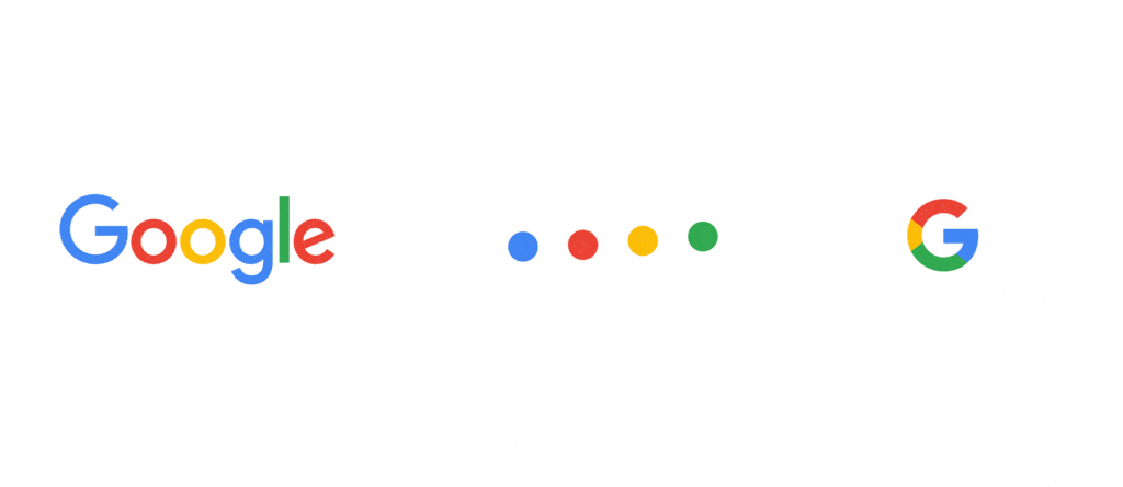
Cohesive: Every visual identity element should work together to create a cohesive whole. For example, Google’s mix of Material You design and a sans-serif font creates a cohesive visual identity.
Visual Identity Examples
Now that we’ve covered the basics of visual identity, let’s take a look at some examples of strong visual identities.
Google
Even though the company has hundreds of sub-brands, Google’s core visual identity is strong and recognisable. Using a sans-serif font, four primary colours, and the Material You design create a cohesive look that can be applied to various assets.
Take any of the Google apps – Gmail, YouTube, Maps – and one will see the same visual elements used throughout. This consistent use of branding helps users quickly identify Google products and services.
Apple
Like Google, Apple also has a strong visual identity applied across all its product lines. The company’s simple colour palette – black, white, and silver – and its use of San Francisco (SF) and New York (NY) as its primary typeface help create a clean and modern look.
When it comes to product design, Apple is known for its minimalism. The company’s products are sleek and polished, with a focus on functionality over form. This approach extends to Apple’s packaging, which is often clean and simple with just a hint of colour.
Woodland
When it comes to visual identity, Woodland is all about nature. The company’s logo is a simple yet recognisable mark that features a tree in green and brown.
The products give a rugged appeal, and the company’s website is filled with images of its product on people enjoying the great outdoors. The brand even has a lookbook that features lifestyle photos of people wearing Woodland gear.
Go On, Tell Us What You Think!
Did we miss something? Come on! Tell us what you think about our article on visual branding in the comments section.
A startup consultant, digital marketer, traveller, and philomath. Aashish has worked with over 20 startups and successfully helped them ideate, raise money, and succeed. When not working, he can be found hiking, camping, and stargazing.
Each week I share research backed AI oriented content in my newsletter.
There are AI ideas, AI trends, tutorials, and guides.
24k entrepreneurs read it. I'd love you to join.